Late Saturday afternoon, White House Press Secretary Sean Spicer hastily addressed the assembled media. The topic of his briefing — the media. Spicer took issue with the reporting of two stories within the first twenty-four hours of the Trump administration. He pointed out the media’s eagerness to incorrectly report that the bust of Dr. Martin Luther King, Jr. had been removed from the Oval Office, when, in fact, it had not been removed. Additionally, Spicer took on claims by the media that the audience for Trump’s inauguration was significantly smaller than previous inaugurations, in particular, those of President Obama.
Some media outlets have been quick to show images, purported to be side-by-side comparisons of the crowds at the Obama and Trump inaugurations, respectively. Some have also reported estimated crowd numbers and DC Metro subway ridership figures.
All of the reporting seems a bit hasty, especially since it seems like the reporting is, once again, being done to support a narrative that Trump has significantly less support than previous presidents, despite winning the election.
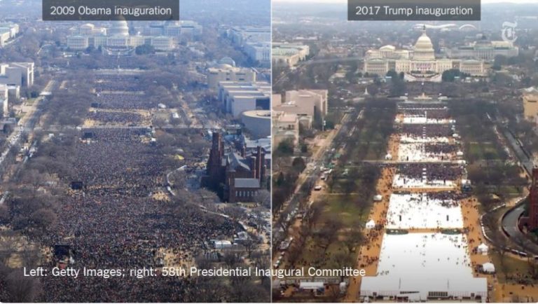
The most popular image that seems to be making the rounds is this one:

Clearly, the image on the left appears to show more people on the National Mall than the picture on the right. However, without some kind of verifiable time stamps, we have no way of knowing when, during the day, each of these pictures was taken. It’s very possible that the image on the right, from 2017, was taken several hours before the inauguration ceremony began.
There have been several reports that Obama’s inauguration crowds measured 1.8 million in 2009 and 1 million in 2013. These numbers are estimates based on satellite and photographic images. While there’s no reason to doubt these numbers, and given the historical nature of Obama’s presidency which would lend such estimates credence, there simply isn’t a definitive way to count. The National Park Service stopped releasing crowd estimates in 1995, after the practice became highly politicized.
The estimates also doesn’t factor in things like weather or the proximity of the respective president’s supporters to Washington, DC. After all, Trump lost Virginia, Maryland, and the District of Columbia to Hillary Clinton, the last two by wide margins. Obama won all three in both 2008 and 2012. There’s no question that there were more Obama supporters within the greater Washington, DC metropolitan area than there are Trump supporters.
Looking at more than just the photographs above, however, may lead some to different conclusions about the disparity in size between 2009, 2013, and 2017.
Brit Hume, of FOX News, provided some anecdotal evidence that runs counter to the side-by-side image originally released by the New York Times.
I was in the building at the bottom of picture on right yesterday. Shot was taken early, area was considerably fuller by time of speech. https://t.co/bzhWjm4alC
— Brit Hume (@brithume) January 22, 2017
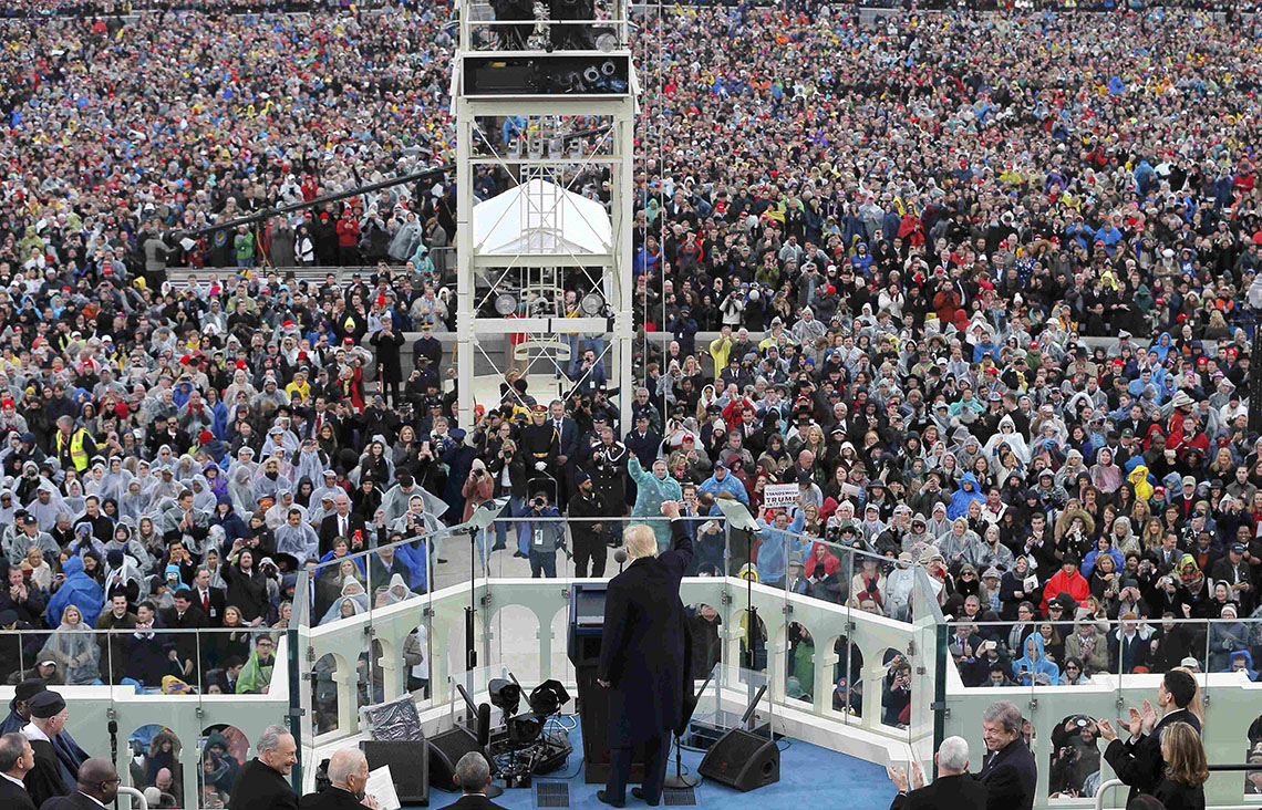
Essentially, he’s making the argument that the timing of the two pictures aren’t analogous. This argument seems to carry some weight, as more images have been released showing a significantly larger crowd for Trump than the first image would suggest.
This photo shows Trump speaking at Inauguration with crowd going down to Washington Monument. @seanspicer pic.twitter.com/Bl4pvUclpe
— T-Covfefe (@MyPlace4U) January 22, 2017
Additional photos, at the time of the inaugural speech, reflect this conclusion.
https://twitter.com/MaxHayzz/status/823006755479289856
This image may be the best to show the crowd stretching back to the Lincoln Memorial, a fact claimed by Trump officials but disputed in the media.
https://twitter.com/JayKlos/status/822980172211101696
While it may be a stretch to conclude that Trump’s crowd matched the size of Obama’s in 2009 or 2013, the difference likely wasn’t as large as many outlets have been suggesting.
But then there was this claim, made by Sean Spicer yesterday, that has drawn a lot of scorn and scrutiny from the media:
This was the largest audience to witness an inauguration, period, both in person and around the globe.
Now, it’s not clear from context whether Spicer was referring to the size of the crowd on the Mall or the entire audience who watched the inauguration, both live and otherwise. It would seem he’s making the latter claim, which seems like it may be true.
According to Nielsen estimates:
The swearing-in of the 45th president was seen by 30.6 million viewers across 12 networks.
That makes it the second-highest in 36 years, behind only Obama’s in 2009.
So how, then, could Trump’s be the largest audience? Well …
… Trump could have been seen by more viewers than either Obama or Reagan. Nielsen ratings do not account for online viewing, which has grown sharply in recent years and is far more commonplace than even four years ago. CNN.com, for example, clocked 16.9 million live streams, tying with its Election Day coverage for the site’s top event (live stream tallies are typically not apples-to-apples with Nielsen’s strict methodology of counting average viewers, but are still additive). Plus, portals like YouTube, Facebook and Twitter offered live streams as well.
In 2009, Facebook, Twitter, YouTube, and traditional websites didn’t have live video viewership anywhere near what they have today.
So in totality — live crowd, plus TV and cable viewership, plus on-line viewership — it would be reasonable to assume that yes, in fact, Trump’s inauguration had the largest audience … period.


